Šedík and Bubi
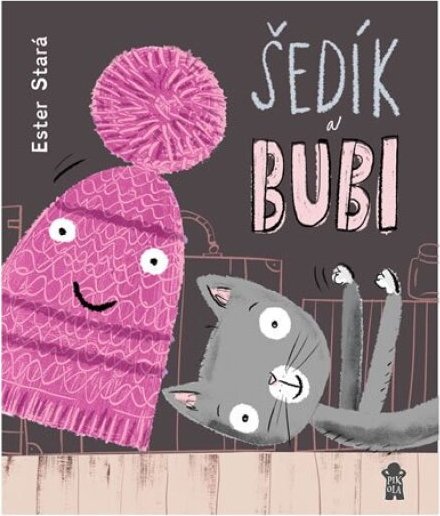
Main idea: A dyslexia-friendly typeface, shaded syllables and short chapters with comics.
A book that never signals to a struggling reader that it is “for weaker readers”. It is simply a lovely story — it just reads more easily.
A little more about the book
The text is split into short sections, avoids consonant clusters, syllables are visually separated by alternating shades and the book is set in the Dyslexie typeface. Direct speech appears in comic speech bubbles.
Photo: 65. pole / Pikola